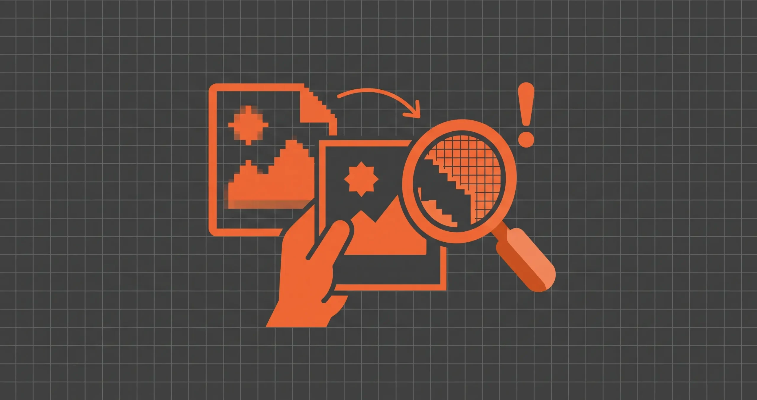
Why Your 300 DPI File Still Prints Blurry
You did everything the tutorials told you. You set the document to 300 DPI, exported it, sent it to the printer, and the result came out soft. The edges of the text look fuzzy, the photo looks like it was taken through a smudged window, and the line art has a faint stair-step pattern along every curve.
The frustrating part is that the file still says 300 DPI when you check it. So what went wrong?
The short answer is that 300 DPI describes how densely pixels will be packed onto paper. It says nothing about whether there are enough pixels in the first place, or whether those pixels contain any real detail.
A file can carry the 300 DPI label and still be blurry for half a dozen reasons, and most of them happen before the file ever reaches the printer.
The DPI number is just a note attached to the file
A digital image is a grid of pixels. A photo that is 1200 pixels wide and 1800 pixels tall has exactly that many squares of color, and nothing you type into a settings box will change how much detail lives inside them.
The DPI (or more accurately PPI, pixels per inch) value is a piece of metadata. It tells the printing software how many of those pixels to squeeze into each inch of paper. Set a 1200 × 1800 image to 300 PPI and it prints at 4 × 6 inches. Set the same image to 72 PPI and it prints at roughly 16.7 × 25 inches. The pixels are identical in both cases. Only the instruction changed.
This is why “I changed it to 300 DPI” fixes nothing on its own. In Photoshop, if you change the resolution with Resample turned off, the print size shrinks and the pixel count stays put.
If you change it with Resample turned on, the software invents new pixels by averaging the old ones. You get a bigger file with the same amount of real detail, spread thinner.
Pixel dimensions are the number to check
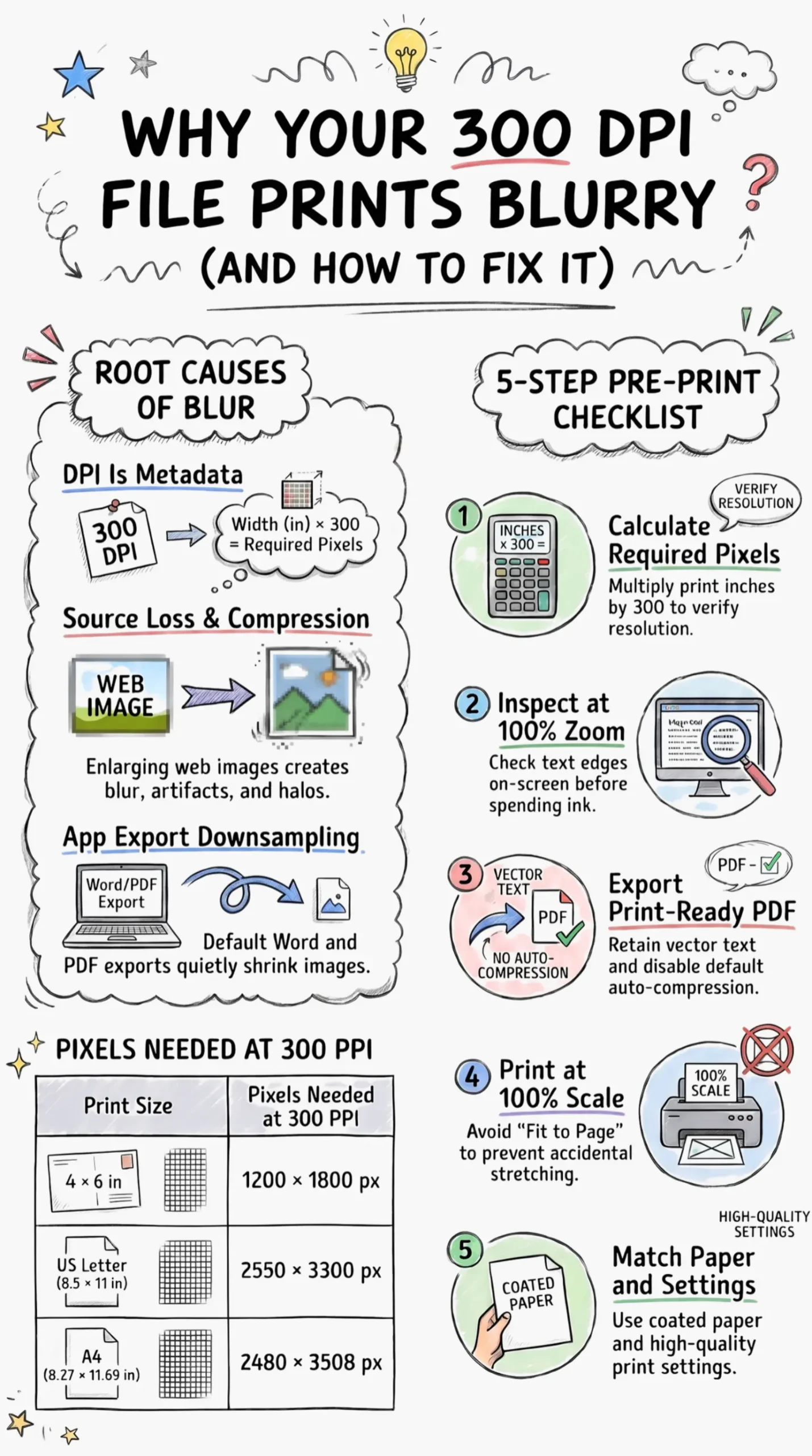
If you want to know whether a file will print sharply, ignore the DPI field and look at the width and height in pixels. Then do one multiplication: print size in inches times 300.
| Print size | Pixels needed at 300 PPI |
|---|---|
| 4 × 6 in | 1200 × 1800 |
| 5 × 7 in | 1500 × 2100 |
| 8 × 10 in | 2400 × 3000 |
| US Letter (8.5 × 11 in) | 2550 × 3300 |
| A4 (8.27 × 11.69 in) | 2480 × 3508 |
| 11 × 14 in | 3300 × 4200 |
A file that claims 300 DPI but measures 800 × 1000 pixels has enough real detail for about a 2.7 × 3.3 inch print. Stretch it across a sheet of Letter paper and each original pixel covers more than three printed dots in each direction. Your eye reads that as blur.
There is some forgiveness here. A poster seen from across a room can get away with 150 PPI, and many photos look fine at 200 to 240. Small text, thin lines and anything a person holds in their hand need the full 300, because hands bring paper close to the face.
The detail was lost before you started
Sometimes the pixel count is fine and the print is still soft. When that happens, look at where the image came from.
A picture saved from a website, a social media download or a screenshot usually started life at screen size, often under 1500 pixels wide. If someone later enlarged it to 3000 pixels and saved it at 300 DPI, the file now passes every number check and still holds only the detail of the small original.
Old-style upscaling blurs edges to fill the gaps.
AI upscalers do better and can produce surprisingly clean results, but they guess at the missing detail, and on text, fine patterns or faces those guesses can look smeared or oddly waxy once printed.
Compression causes a similar problem. Every time a JPEG is saved, it throws away some information to keep the file small. Run an image through a few rounds of editing and re-saving, or export it at a low quality setting, and you get blocky patches in smooth areas and halos around sharp edges.
On screen, at normal zoom, you rarely notice. On paper at 300 PPI, those artifacts sit right where your eye goes: along the edges of letters and around the outline of a subject.
A quick test is to zoom to 100% or 200% on your screen and look at the edges of text and high-contrast areas. If they look mushy or blocky there, the print will show the same thing.
Your export settings shrank the file without telling you
This is the cause people miss most often, because it happens at the very last step. You can build a perfect 3000-pixel design and then lose most of it in the save dialog.
Microsoft Word is a common offender. By default it compresses pictures inside the document to keep the file small, and the default target resolution is lower than 300. Paste a sharp image into Word, save, export to PDF, and the image may come out noticeably softer.
You can turn this off under File > Options > Advanced, in the Image Size and Quality section, by ticking “Do not compress images in file” and setting the default resolution to high fidelity.
PDF exports have the same trap. Presets meant for email or the web, like “Smallest File Size” in Adobe tools, downsample images to save space. In Canva, “PDF Standard” is aimed at screen viewing and “PDF Print” is the one meant for printing. If you sell printables and your buyers complain about blurry results, check which option you exported with first.
There is also the question of text. In a properly exported PDF, text stays as vector shapes, which print crisply at any size. If you export a design as a PNG or JPG, the text becomes pixels like everything else, and small type is where low resolution shows first.
For anything text-heavy, such as planners, worksheets or forms, a vector PDF will almost always print sharper than an image file of the same page.
Sometimes the file is fine and the printer isn’t
If the file holds up at 100% zoom and the pixel math checks out, the problem may be on the printing side.
Scaling is the first thing to check. Many print dialogs default to “Fit to page” or “Scale to fit.” If your design is 4 × 6 inches and the dialog stretches it to fill a Letter page, your 300 PPI file is now printing at roughly 165 PPI.
The reverse matters too: an A4 file printed on US Letter paper gets shrunk or cropped, and buyers in different countries will run into this with printables sized for only one standard. Print at “Actual size” or 100% when you want the file to come out the way you made it.
Paper makes a bigger difference than most people expect. Cheap copy paper is porous, so inkjet ink spreads into the fibers as it lands. Printers call this dot gain, and it softens fine lines and small text.
The same file printed on coated photo paper or a smoother matte stock will look visibly sharper. Make sure the paper type in the print settings matches the paper in the tray, too, since the printer adjusts how much ink it lays down based on that setting.
Then there are the quality settings. “Draft” or “Fast” modes use less ink and fewer passes, and the result looks it. A home inkjet that has been sitting unused can also have partly clogged nozzles, which shows up as faint streaks or a general fuzziness. Running the printer’s built-in nozzle check and head cleaning takes a couple of minutes and rules this out.
A five-minute check before you print or sell a file
Most blurry prints can be caught before any ink touches paper. Run through this list whenever a file matters, and especially before you upload a printable for buyers who will print it on equipment you’ll never see.
- Check the pixel dimensions and divide by the print size in inches. If the answer is under 300 for small or text-heavy work, find a bigger source or print smaller.
- Ask where the image came from. A screenshot or web download that was enlarged later only has the detail of its original size.
- Zoom to 100% and 200% on screen and look at text edges and high-contrast outlines for blockiness or halos.
- Export to PDF with a print preset, keep text as vector, and turn off image compression in Word or any app that applies it by default.
- Print at actual size on the right paper, with the matching paper type and a normal or high quality setting.
If you sell printables, it helps to put a short note in the instructions telling buyers to print at 100% scale and not to use “Fit to page.” It cuts down on messages from people who did everything else right.
The 300 DPI rule is still worth following. It just only works when the pixels behind it are real, when nothing strips them out on export, and when the printer is told to use them as they are.
Recommended Tools For Etsy
Design Nexus newsletter – Get simplified Etsy tips and modern marketing strategies — plus a free Digital Product Starter Kit!
Craft picks
Tools worth checking out
- See it on Amazon (Cricut Maker 5)
- See it on Amazon (Silhouette Cameo 5)
- See it on Amazon (Silhouette Portrait 4)
- BrotherBrother ScanNCut SDX125Scans a drawing or printed shape and cuts around it, no computer needed.See it on Amazon (Brother ScanNCut SDX125)
- CricutCricut EasyPress 3Even heat for iron-on and Infusible Ink, with settings from the Cricut Heat app.See it on Amazon (Cricut EasyPress 3)
- See it on Amazon (Cricut Mug Press)
- See it on Amazon (Cricut Joy Xtra)
As an Amazon Associate I earn from qualifying purchases.
I have made an entire section of helpful and mostly free tools you can use to build a successful online business on Etsy. See the tools here.
Kittl – A go-to place for any person, who wants to make money with print-on-demand on Etsy.
Creative Fabrica. They have millions of cheap graphics that can elevate your t-shirt design.
Vectorizer – This tool transforms your image into a vector with seconds. scalable without losing the quality.
Disclosure: Some of the links above may contain affiliate partnerships, meaning, at no additional cost to you, NechEmpire may earn a commission if you click through to make a purchase.