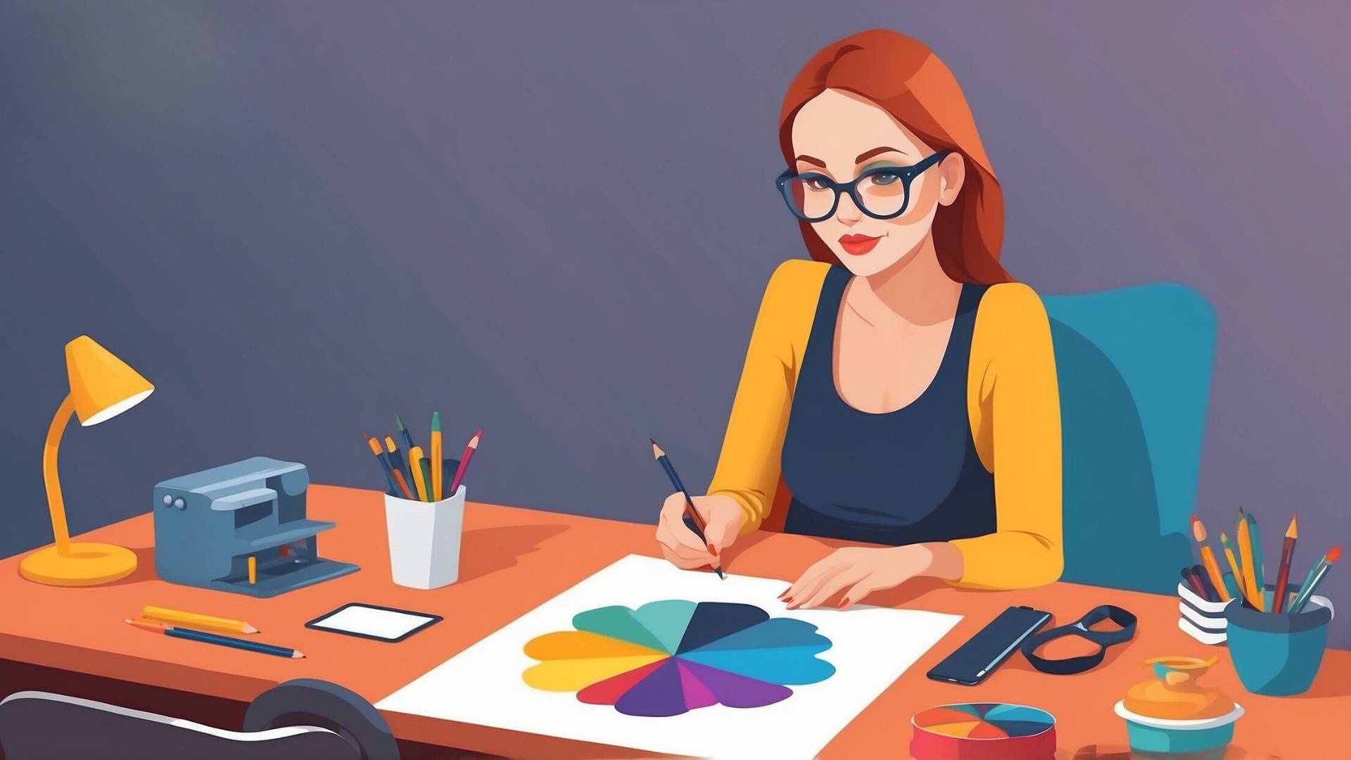
If you’ve ever created a design on your computer that looks bright and perfect on screen, only to print it out and feel disappointed, you’re not alone.
This happens to so many people.
As an Etsy seller using the print-on-demand method, I’ve faced this problem more times than I can count.
It’s frustrating when your beautiful digital designs don’t come out the way you imagined when printed.
But why does this happen?
Let’s talk about what’s going on and how you can make sure your prints look as close to your digital designs as possible.
Why Do Colors Look Different?
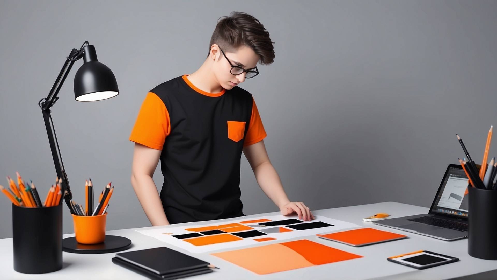
The big reason for this issue is that screens and printers handle color in different ways.
When you’re looking at your design on your computer or phone, the colors you see are made of light.
- The screen is shining tiny red, green, and blue lights at you to create every color. This is called RGB, which stands for Red, Green, and Blue.
But when you print something, your printer uses ink, not light.
- The printer works with CMYK inks, which stand for Cyan (light blue), Magenta (a pinkish red), Yellow, and Black.
These inks blend together to make all the colors. This is where the problem starts.
RGB and CMYK don’t always match perfectly. That’s why sometimes the colors in your printed designs can look duller or darker than they did on your screen.
What Should You Know
- Color Models Serve Different Purposes: RGB (Red, Green, Blue) and CMYK (Cyan, Magenta, Yellow, Black) are two distinct color models. RGB is used for digital screens, while CMYK is for printing. The way colors are produced in these models is fundamentally different: RGB creates color by mixing light, while CMYK does so by mixing inks.
- Color Gamut Differences: RGB has a wider color gamut, meaning it can display a broader range of colors compared to CMYK. This is why designs on your screen may appear more vibrant. When you convert to CMYK for print, some of those bright or saturated colors may become duller or muted.
- Conversion is Key: If you’re designing for print, it’s crucial to create your design in CMYK from the start or convert it to CMYK early in the process. This ensures that you are working within the color limits of print and can make adjustments as needed, reducing the risk of surprises when the final product is printed.
- Proofing is Essential: Always request or perform a print proof before finalizing your design. A print proof shows how your design will look when printed, allowing you to spot any issues related to color discrepancies and make necessary adjustments.
- Monitor Calibration Affects Accuracy: The colors you see on your screen are influenced by your monitor’s settings. Regularly calibrate your monitor to ensure colors are as accurate as possible, but remember that even with calibration, the difference between RGB on screen and CMYK in print is inevitable.
Screen Colors Shine; Ink Colors Absorb
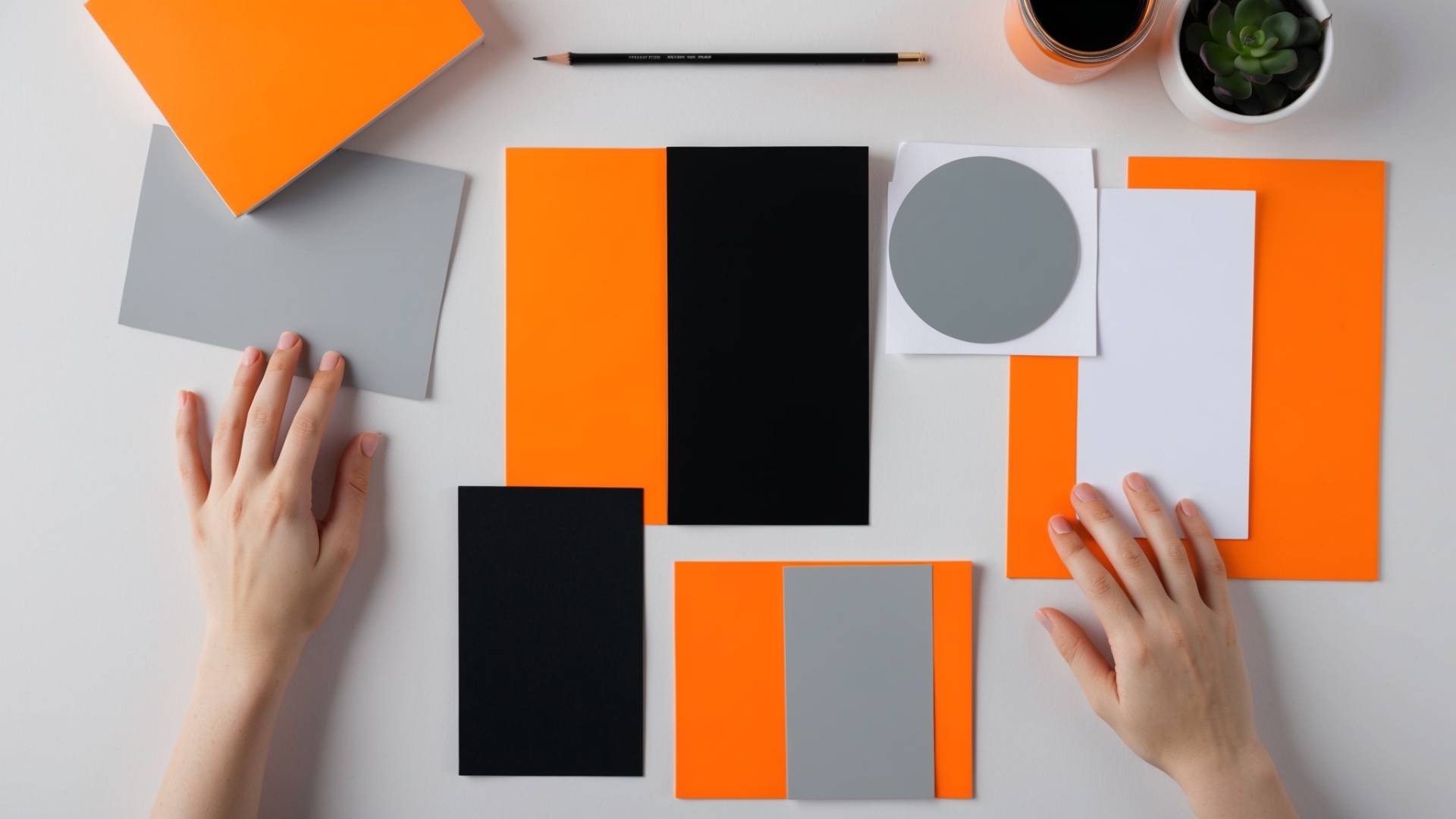
On your screen, the colors are bright because they’re made with light.
Think of it like shining a flashlight on a wall. It’s bright and colorful.
But when you print, you’re using ink on paper. The paper absorbs the ink, which makes the colors less vibrant.
You can get close, but you can’t get the same brightness that light gives you on a screen.
A great way to think of this is like trying to paint a picture of a sunset using crayons. You might be able to get the general idea, but the colors won’t be as bright or smooth as the real thing.
How To Fix This
Now, does this mean you should just give up and only use CMYK when designing?
No.
In fact, designing in RGB first can actually help your creativity.
It gives you more colors to play with. But you need to know how to bridge the gap between RGB on your screen and CMYK in your prints.
- Design in RGB: It’s tempting to switch to CMYK right away, but stay in RGB mode while designing. You’ll have a wider range of colors to work with, and you can capture the exact look you’re going for.
- Use a CMYK Preview: Most design programs let you preview what your design will look like in CMYK. This won’t be perfect, but it will give you a good idea of how the colors might shift when printed. It’s like a sneak peek into the printing world.
- Order Samples: Never skip this step! I used to skip ordering samples because I was short on time or wanted to save money but trust me, it’s worth it. Every printer is different. The type of paper, the inks, and even the lighting in the room when it’s printed can change how your final product looks. Ordering a sample lets you see how your design will really look on the final product.
Choose the Right Colors
One of the biggest lessons I’ve learned is that not all colors print well.
Bright neon colors that look amazing on screen can end up looking dull when printed.
Printers just can’t capture the brightness of some colors. If you’re using very bright or very subtle shades, be aware that they may not translate perfectly onto paper or fabric.
But instead of trying to match the exact colors, focus on creating contrast.
Contrast means using light and dark colors together to make things stand out.
Even if the colors aren’t as bright as they were on screen, you can make them pop by pairing them with a darker or lighter shade.
For example, instead of using a bright neon green on its own, pair it with a dark blue or navy. This way, the green might look a bit duller, but it will still stand out.
Material Matters
Another important thing to keep in mind is the material you’re printing on.
The same design can look very different depending on whether you’re printing on paper, fabric, or a mug.
Just imagine, if you print your design on a white mug, the colors will usually look brighter. But if you print on a black t-shirt, the colors might look more muted because the dark fabric absorbs some of the ink.
Before you print a large batch of products, always order a sample to see how your design looks on the material you’re using. It’s a small step that can save you a lot of frustration and wasted money.
Save in RGB, Not CMYK
This might surprise you, but when you’re ready to send your design to the printer, save it in RGB.
Even though printers use CMYK, saving your design in RGB keeps more color information in the file.
This helps the printer get as close as possible to the colors you see on your screen. It’s a simple trick that can make a big difference in the final print.
Be Realistic with Bright Colors
Some colors, like neons and very bright shades, just don’t print well.
It’s a reality of the printing world.
But instead of getting confusing, you can get creative.
If you’re set on using a bright neon color, try adjusting your design. Maybe use a slightly more muted version of the color and pair it with something bold and dark to make it stand out.
Another option is to experiment with different printing techniques.
Screen printing can sometimes handle bright colors better than other types of printing. Explore your options and be open to adjusting your design to work with the limitations of printing.
Print Offers Unique Benefits
It’s easy to get caught up in the challenges of printing, but print also offers some unique advantages.
When you print your designs, you get something you can hold, touch, and share with others.
The texture of the paper or fabric, the weight of a business card, even the smell of fresh ink can make a big impact.
You can also experiment with things like glossy or matte finishes.
Glossy prints have a smooth, shiny surface that can make your colors pop, while matte finishes give a more subtle, sophisticated look.
Playing with these different textures can bring your designs to life in ways that digital screens just can’t.
Just understand that designing for print is all about understanding the differences between how colors work on screen and in real life.
By following these steps, you can avoid the disappointment of a print that doesn’t match your vision.
Sometimes you’ll need to adjust your design to work within the limits of printing, but that doesn’t mean you have to settle for less.
Recommended Tools For Etsy
Design Nexus newsletter – Get simplified Etsy tips and modern marketing strategies — plus a free Digital Product Starter Kit!
Creative But Fine newsletter – This is your source if you want more detailed guides about Etsy and graphic design.
I have made an entire section of helpful and mostly free tools you can use to build a successful online business on Etsy. See the tools here.
Kittl – A go-to place for any person, who wants to make money with print-on-demand on Etsy.
Creative Fabrica. They have millions of cheap graphics that can elevate your t-shirt design.
Vectorizer – This tool transforms your image into a vector with seconds. scalable without losing the quality.
Disclosure: Some of the links above may contain affiliate partnerships, meaning, at no additional cost to you, NechEmpire may earn a commission if you click through to make a purchase.
- How to Highlight an Image with a Glowing Neon Frame in Canva - December 13, 2025
- How to Curve & Wrap Text Around a Circle in Canva (Step-by-Step Tutorial) - December 13, 2025
- How To Remove Background In Canva Mobile App - September 4, 2025


