Imagine walking down the street and seeing someone wearing a t-shirt you designed.
How awesome would that feel?
Or getting an alert that you made another sale while you were sleeping.
Pretty sweet, right?
Creating and selling t-shirt designs online is a fun side hustle that can earn you extra cash.
But there’s the thing – you need to make designs that people actually want to buy.
That’s where I come in.
I’m going to share the 3 essential rules that took my t-shirt business from an embarrassing failure to a money-making success.
These tips will show you how to create designs that fly off the virtual shelves.
Why This Guide Will Change Your T-Shirt Game
Maybe you’re brand new to t-shirt design.
Perhaps you’ve tried it before but couldn’t get any traction.
Either way, these rules are about to transform how you approach t-shirt design.
You’ll learn:
- How to create eye-catching designs that grab attention
- The secrets to limiting colors for cheaper production costs
- Tricks for simplifying your art so the message comes through loud and clear
Mastering these 3 guidelines will take your skills to a pro level.
You’ll be creating designs that people not only want to buy but wear with pride. Let’s get started!
Rule #1: Fill That Rectangular Canvas
The first rule of successful t-shirt designs?
Fill up that rectangular space on the shirt. Going too small or leaving too much blank space makes your art look puny and forgettable.
The ideal design dimensions are 16 inches wide by 20 inches tall.
That’s the sweet spot size that looks great on most adult shirts.
So aim to create illustrations, text, and graphics that come close to filling up that entire zone.
But don’t get carried away and try to cram too much stuff in there either. A little breathing room is okay.
The key is finding the perfect balance of artwork and negative space.
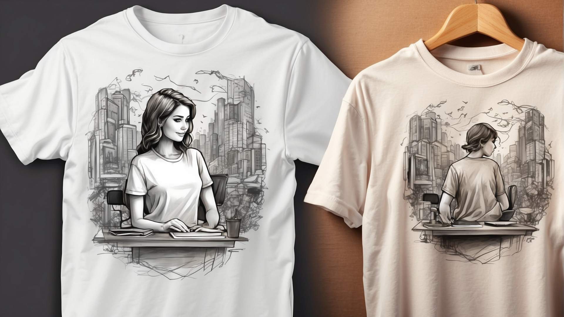
An easy way to accomplish that balance is with a centrally located badge design. A circular or rectangular emblem placed right in the middle makes stellar use of the space.
Simple text in a bold, stylized font works great as a statement piece too.
Whatever design elements you use, make sure they feel substantial and visually oustanding.
Avoid anything too small or crowded in the corners. You want people’s eyes to zero in on your artwork, not have to search for it.
Rule #2: Go Easy on the Color Palette
Back when I first started with t-shirt design, I made a huge rookie mistake – using a bazillion different colors in each design.
We’re talking every single shade of the rainbow, plus a few neons thrown in for good measure.
My thinking was that more colors = more vibrant, noticeable designs.
But you know what that actually got me? A whole lot of confused looks and $0 in sales.
Here’s the harsh truth about using too many colors: it makes your shirts way more expensive to produce.
Like, exponentially more expensive with each added hue.
A basic one-color design may only cost $3 to print. Two colors bumps that up to $5. Add a third color and now we’re talking $7 per shirt. Using 5 or 6 colors could potentially double or triple those costs!
Those sky-high price tags discourage shoppers from buying. No one wants to pay $20 for a basic t-shirt design. So do yourself a big favor and seriously limit your color palette.
My rule of thumb?
Stick to just 2-4 complementary colors per design. Any more than that and you’re just making things difficult.
Get yourself a free color palette tool online to experiment with flattering hues.
Limiting colors has another bonus: it forces you to get more creative with shading and texture.
Seeing your artwork with a more minimalist vibe is pretty darn cool too.
Rule #3: Keep It Simple
Let’s be honest, t-shirts are pretty small canvases.
They’re not meant for replicating entire epic fantasy novels or re-telling The Lord of the Rings trilogy.
Anything too complex or overstuffed gets muddled and confusing.
When I started, I naively thought going big and bold with tons of details would help my designs pop.
So I’d try to cram everything including the kitchen sink into each illustration.
Do you know where that got me?
Weird designs, overwhelming messes that no one understood. My shirts made zero sense and therefore, zero sales.
Don’t make that same mistake!
Take a minimalist mindset when it comes to t-shirt art. Focus on highlighting one core idea, scene, or message.
For example, say you’re creating shirts for your tropical surf camp. Instead of showing every activity under the sun, focus on one iconic visual.
Like a vintage beach truck with a surfboard on top. Add some simple text reinforcing the surf vibes and that’s it! Clean, straightforward, and easy for customers to instantly grasp.
That doesn’t mean you need to be boring though.
Feel free to get creative with stylized fonts, shading & textures, and fun graphical elements.
Just make sure to balance any complexities with negative space. Give those bold visuals room to breathe and stand out.
Make Your T-Shirt Designs Stand Out
There you have it – the 3 holy rules of successful t-shirt design. Fill up that rectangular canvas without overcrowding. Severely limit your color palette.
And keep your designs clear and focused on one core concept.
Follow those guidelines and you’ll be creating t-shirts that are eye-catching, affordable to produce, and most importantly – something people want to buy and proudly wear.
It’ll take some practice for sure. But stick with it and you’ll develop a knack for walking that tightrope of stylish and straightforward designs.
Before you know it, you’ll be the t-shirt mogul of your neighborhood.
Recommended Tools For Etsy
Design Nexus newsletter – Get simplified Etsy tips and modern marketing strategies — plus a free Digital Product Starter Kit!
Creative But Fine newsletter – This is your source if you want more detailed guides about Etsy and graphic design.
I have made an entire section of helpful and mostly free tools you can use to build a successful online business on Etsy. See the tools here.
Kittl – A go-to place for any person, who wants to make money with print-on-demand on Etsy.
Creative Fabrica. They have millions of cheap graphics that can elevate your t-shirt design.
Vectorizer – This tool transforms your image into a vector with seconds. scalable without losing the quality.
Disclosure: Some of the links above may contain affiliate partnerships, meaning, at no additional cost to you, NechEmpire may earn a commission if you click through to make a purchase.
- How to Highlight an Image with a Glowing Neon Frame in Canva - December 13, 2025
- How to Curve & Wrap Text Around a Circle in Canva (Step-by-Step Tutorial) - December 13, 2025
- How To Remove Background In Canva Mobile App - September 4, 2025

