Hey, you. Yeah, you, the one staring at your Canva design wondering why the letters in your heading look like they’re arguing with each other.
You’re not imagining it. Your letters really do look like they’re socially distancing. Or worse, they’re squished together like sardines in a can.
Welcome to the wild world of kerning.
But wait… what is kerning, anyway?

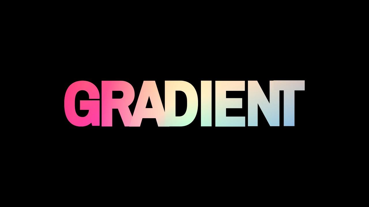
Kerning is another word designers use for the space between individual letters.
Think of it like adjusting the personal space bubble between each letter so they don’t feel awkward. Too close? It looks messy. Too far? Your word falls apart like a bad relationship.
Here’s the twist: Canva doesn’t let you kern. Yep. Shocking. You can’t adjust the space between just two letters.
“But… I thought Canva was the magic tool for beautiful designs?”
Oh, it is. But Canva decided to skip giving us full kerning powers. Instead, they gave us something called letter spacing (sometimes called tracking). Basically, you adjust the space between all letters at once.
Not ideal? Sure. But workable? Absolutely. And I’m going to show you how.
Let’s fix those awkward letters once and for all.
What Should You Know
- Kerning = space between letters. Canva doesn’t support it for individual pairs.
- You can still adjust letter spacing for the whole word or line.
- For perfect spacing, break letters into separate text boxes and move them manually.
- Use grouping to lock them in place once it looks good.
- Save manual kerning for logos, titles, or designs where words are few but important.
- Don’t obsess over perfection for long paragraphs—it’s not worth the headache.
First, let’s get real about Canva’s kerning problem.
Canva was built for everyone, not just pro designers who throw words like “typography” and “leading” around at dinner parties. Canva’s focus is simplicity. That’s why they left out advanced tools like kerning.
I learned the hard way (and by “hard way,” I mean squinting at my logo for hours thinking “something’s off”) that even small spacing tweaks can make a huge difference.
I once designed a friend’s bakery logo in Canva. Everything looked good… until I printed it.
The word “cakes” ended up looking like “c akes.” That awkward gap between the “c” and “a” made it look like a typo. Customers were confused. And let me tell you—confused people don’t buy cupcakes.
So yeah, letter spacing matters.
Let’s get into it.
How to adjust letter spacing in Canva (the easy way)
Here’s how you do it:
Step 1: Open your Canva project.
Step 2: Click on the text box you want to fix.
Step 3: Look at the toolbar on top. See that button called “Spacing”? Click it.
Step 4: A slider will pop up labeled “Letter Spacing.” Drag it right to spread the letters out, or left to bring them closer together.
Step 5: Stop when it looks right to your eye.
That’s it. Really. Easy, right?
But here’s where people mess up: they move the slider to a random number and call it done.
Don’t do that.
Look at the whole word. Does anything feel off? Do certain letters look like they’re drifting away from the others? Sometimes, increasing spacing makes letters too disconnected. Sometimes, reducing it makes them crash together like a mosh pit.
My advice? Zoom out. Step back. Squint if you have to. Trust your eyeballs. There’s no magic number. Just what looks balanced.
“But what if one letter looks wrong?”
Ah, you caught it. The catch.
Here’s where Canva’s missing kerning feature bites. You can’t fix the space between just two letters.
Let’s say your word is “AVATAR” and the “A” and “V” are too far apart. Normally, in pro design software, you’d just adjust the space between those two. Canva? No.
But there’s a sneaky workaround.
Here’s my secret move (warning: it’s a little tedious, but worth it):
- Break the word into separate text boxes. Yep. Each letter or pair of letters gets its own box.
- Move them manually. Drag each letter closer or farther until it looks perfect.
- When you’re happy, select all the text boxes and click “Group.”
DIY kerning.
I once spent 30 minutes nudging letters one pixel at a time to get a client’s logo to look perfect. Did I question my life choices? Absolutely. But the end result? Chef’s kiss.
Would I recommend this for a long paragraph of text? Please, no. Save this trick for logos, headlines, or big bold words where every letter counts.
Important: Patience is your best tool.
Look, Canva’s not going to give you Photoshop-level typography control. It’s not built for that. But it can still look professional if you’re willing to tweak and experiment.
Sometimes you’ll move a letter five times before it feels right. Sometimes you’ll think it’s right… and then see it again tomorrow and hate it. That’s normal.
Typography is part science, part art, and part “why does this one letter look weird and nobody else notices except me?”
Take your time. Trust your gut.
And as you see, your simple, no-nonsense guide to kerning in Canva. Will it turn you into a typography wizard overnight? No. But it’ll keep your letters from looking like they’re running away from each other.
Go forth. Space those letters. And may your designs never spell “Wil” again.
FAQs
Can I kern letters individually in Canva?
Canva doesn’t let you adjust space between specific letters. But you can move letters manually using separate text boxes.
Is adjusting letter spacing enough for most designs?
For basic designs like posters, Instagram graphics, or flyers, the letter spacing slider usually works fine.
Should I bother breaking text into separate boxes?
Only for important words like logos, headlines, or short titles. Doing it for long text will drive you crazy.
How do I know if my spacing looks good?
Step back, zoom out, squint—seriously. If it feels balanced to your eye, it’s probably good.
Will Canva ever add kerning features?
Maybe, but it hasn’t happened yet. Canva focuses on simplicity over advanced typography tools.
Why does Canva limit typography options?
Canva’s goal is to stay user-friendly for non-designers. Advanced typography tools might overwhelm beginners.
Is there a Canva alternative for better kerning?
Programs like Adobe Illustrator or Photoshop give you full kerning control. But they come with a steeper learning curve.
BONUS FOR YOU: Get the Digital Product Starter Kit and start building your own online business today.
Here Are Some of My Favorite Tools For Print-on-demand
As a graphic designer and POD seller, I’ve had the opportunity to discover different helpful products and tools that can be time-saving and make the process of creating your designs a bit smoother.
DESIGNS: Kittl (best for t-shirt designs), Vexels (for professional designs), Placeit (for unique product mockups)
GRAPHICS: Creative Fabrica (cheapest marketplace), Envato Elements (more variety)
SELLING DESIGNS: Creative Fabrica (for advanced graphic designers)
ETSY:
- Research – Alura (best), ProfitTree ( beginners)
- Fulfillment – Printul (beginners), or Printify (advanced).
Disclosure: Some of the links above may contain affiliate partnerships, meaning, at no additional cost to you, NechEmpire may earn a commission if you click through to make a purchase.
- How to Highlight an Image with a Glowing Neon Frame in Canva - December 13, 2025
- How to Curve & Wrap Text Around a Circle in Canva (Step-by-Step Tutorial) - December 13, 2025
- How To Remove Background In Canva Mobile App - September 4, 2025


