Why Your Design Looks Amateur (It’s Usually the Spacing)
Your fonts are probably fine. That color palette you agonized over for an entire Sunday afternoon is likely fine as well.
Somewhere along the way, though, a little voice convinced you that your work looks cheap because of a missing ingredient, some premium typeface or trendy gradient that real designers keep in a secret drawer.
So you bought another font bundle. Then you bought one more, just to be safe.
And the damn thing still looks like a garage sale flyer.
The real answer is far less exciting than a new font. Amateur design almost always comes down to spacing.
Cramped margins, uneven gaps, text jammed against the edge of a button, and elements scattered around with no visible relationship to each other will make a layout feel homemade faster than any ugly typeface. Good spacing is invisible when it’s right and painfully obvious when it’s wrong.
Why is that so annoying to hear? Probably because space feels like nothing. Empty room on a page doesn’t look like effort, and a client can’t point at it and say that’s what the invoice paid for.
Logos get credit. Clever illustrations get credit too. Those 40 pixels sitting between a headline and the paragraph under it get zero credit, even though they often do more for the design than the logo ever will.
So if your designs keep landing somewhere between almost and not quite, look at the gaps before you touch anything else.
Empty Space Is Saying Things You Never Meant to Say
Every gap on a page is a message. The human eye reads distance as relationship, which is a fancy way of saying that things sitting close together look like they belong together, and things far apart look like strangers.
Designers call this proximity, and it’s one of the oldest principles in visual perception. It’s also the foundation of visual hierarchy, the order in which someone’s eye moves through a layout.
Picture a simple product card on an online shop. A photo sits on top, then a title, then a price, then a Buy button.
Now imagine the price floats exactly halfway between the title and the button. Does the price belong to the product name, or is it some kind of label for the button? Your brain hesitates for a fraction of a second.
That hesitation is the whole problem. Multiply it across an entire page and the visitor feels a vague unease they can’t name, and they leave thinking the shop seems a little sketchy.
Fixing it is almost embarrassingly simple.
Pull the price closer to the title so they read as one unit, then add more room before the button so it stands on its own.
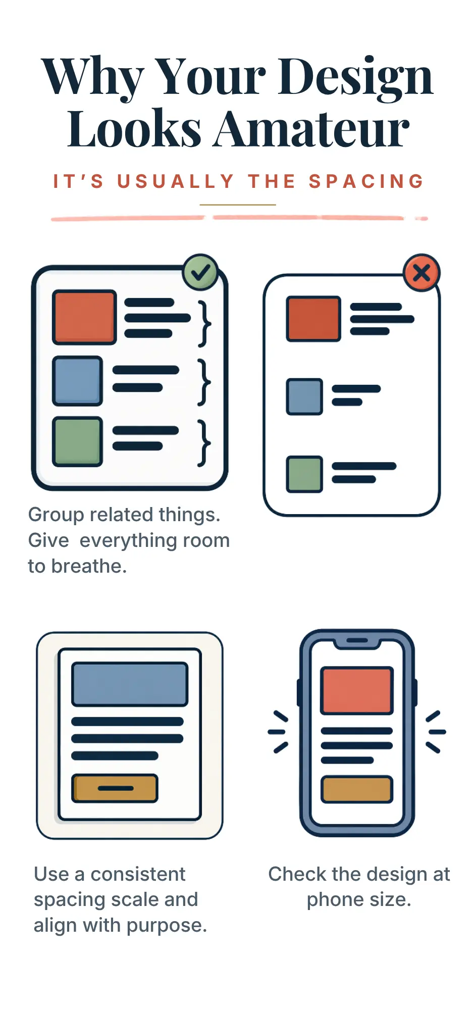
Related things go closer. Unrelated things get pushed apart. The space inside a group should always be smaller than the space between groups, and once you see that rule, you’ll start spotting it broken everywhere, from restaurant menus to your own résumé.
What makes this sneaky is that none of it feels like a decision while you’re working. A text box gets dragged into place, it lands somewhere reasonable, and you move on to the next thing.
Every gap you didn’t choose on purpose is a gap that’s choosing for you.
Cramming Everything In Is Just Fear Wearing a Design Hat
The crowded layouts are rarely the work of lazy people. Usually the opposite is true. Somebody cared so much that they couldn’t stand to leave a single corner empty, so they added a badge, a second tagline, a starburst, a row of icons, and a border around the border.
Empty space feels risky. It looks unfinished, like you forgot to do something, or worse, like you didn’t have enough to say.
So the instinct is to fill it, and every addition feels like an improvement in the moment. Step back, though, and the page has turned into a shouting match where every element fights for attention and none of them win.
This is where trying harder makes things worse. The more you add to prove a design is worth something, the cheaper it looks.
Think about the difference between a luxury perfume ad and a discount store circular. The perfume ad might have one bottle, one line of text, and an ocean of nothing around it.
Meanwhile, the circular has 47 prices screaming in red. Both are selling something. Only one of them looks expensive, and it’s the one brave enough to leave most of the page alone.
Designers call that emptiness white space, though it doesn’t have to be white. Breathing room reads as confidence.
A design with generous margins doesn’t need to beg for your attention, and readers pick up on that whether they know anything about design or not.
The same goes for text. Lines of body copy that stretch across an entire wide screen are exhausting to read, because the eye loses its place jumping back to the start of the next line.
Somewhere around 60 to 75 characters per line tends to feel comfortable. Line height matters too.
Cramped paragraphs set to tight single spacing look like a legal contract, while bumping the line height to roughly 1.5 times the font size lets the words breathe.
The space between letters counts too, and a bit of kerning in Canva fixes headlines that feel squeezed.
So why is it so hard to leave space alone? Maybe because emptiness forces you to trust that what’s already on the page is enough.
That’s a vulnerable thing to believe about your own work, and it’s a lot easier to keep adding stuff than to sit with that feeling.
Consistency Beats Talent, and That Should Annoy You
Professional designers rarely rely on a magic eye that the rest of the world was born without. What they have is a system, and it’s boring on purpose.
Look closely at a well-made website and the spacing values repeat. Eight pixels here, sixteen there, then 24, 32, 48, 64.
Many teams build everything on multiples of four or eight, a habit often called an 8-point grid. Gaps never end up at 13 pixels in one spot and 19 in another because somebody eyeballed it at midnight.
Every distance comes from a short list, and that repetition creates a rhythm the viewer feels even if they could never explain it.
Amateur work, by contrast, is full of almosts. Margins are almost equal, two columns almost line up, and a button has slightly more padding on the left than on the right.
Each one is tiny on its own. Together they create a low hum of sloppiness that makes the whole thing feel off, and the viewer can’t point to why.
Is that unfair? A little.
It means the gap between amateur and professional has less to do with talent than with discipline. Anyone can learn it, which is the good news. The bad news is that learning it is tedious as hell, and no new software will do it for you.
A few habits make an immediate difference.
Pick a spacing scale and refuse to break it. Give text inside buttons and boxes more padding than feels necessary, since tight padding is one of the fastest ways to look cheap.
Align everything to something, whether that’s a grid, an edge, or the text above it.
If you work in Canva, turning on grid lines, guides, and rulers makes this much easier.
Then zoom out to 25 percent, or squint at the screen until the words blur, and look at the shapes.
Clear groups with clean gutters between them mean you’re close. Anything that looks like someone dropped a box of Lego on the floor needs another pass.
And when all of that is done, check it on a phone. Spacing that looks generous on a big monitor can collapse into a cramped mess on a small screen, which is exactly where a huge chunk of your audience is going to see it.
Fixing your spacing won’t earn a single compliment.
Clients won’t email to say they loved the 24 pixels above the footer, and friends won’t notice that the price finally sits next to the product name where it belongs. The best possible outcome is that the design simply stops feeling wrong, and people move through it without friction and without thinking about you at all.
That’s a strange reward for hours of nudging boxes two pixels to the left. Buried in there is the real reason so many designs stay amateur.
Learning a spacing scale takes an afternoon. Caring about something that, done well, nobody will ever see takes a lot longer, and plenty of designers never get there.
So before the next font bundle goes in the cart, open the last thing you made and look at the gaps.
Are they there on purpose? Could you explain why each one is the size it is? If the honest answer is no, that’s fine. It just means the fix was never something you could buy.
BONUS FOR YOU: Get the Digital Product Starter Kit and start building your own online business today.
Here Are Some of My Favorite Tools For Print-on-demand
As a graphic designer and POD seller, I’ve had the opportunity to discover different helpful products and tools that can be time-saving and make the process of creating your designs a bit smoother.
Craft picks
Tools worth checking out
- See it on Amazon (Cricut Maker 5)
- See it on Amazon (Silhouette Cameo 5)
- See it on Amazon (Silhouette Portrait 4)
- BrotherBrother ScanNCut SDX125Scans a drawing or printed shape and cuts around it, no computer needed.See it on Amazon (Brother ScanNCut SDX125)
- CricutCricut EasyPress 3Even heat for iron-on and Infusible Ink, with settings from the Cricut Heat app.See it on Amazon (Cricut EasyPress 3)
- See it on Amazon (Cricut Mug Press)
- See it on Amazon (Cricut Joy Xtra)
As an Amazon Associate I earn from qualifying purchases.
DESIGNS: Kittl (best for t-shirt designs), Vexels (for professional designs), Placeit (for unique product mockups)
GRAPHICS: Creative Fabrica (cheapest marketplace), Envato Elements (more variety)
SELLING DESIGNS: Creative Fabrica (for advanced graphic designers)
Disclosure: Some of the links above may contain affiliate partnerships, meaning, at no additional cost to you, NechEmpire may earn a commission if you click through to make a purchase.